The brand:
betahaus | sofia originates back to Berlin, where the first coworking space “betahaus” was born. After a compelling start, the founders (originally from Bulgaria) decided to return back to their home country and continue spreading the ideas behind betahaus by creating the first-ever coworking space in Bulgaria. Their core values are community, friendliness and development.
Problem/task:
betahaus had an outdated visual design language, which lacked any consistency. The goal was to create a modern visual identity system, which correlates with their brand values, and then apply it to their various channels. Another challenge was staying in line with the new branding of betahaus.de.
Work:
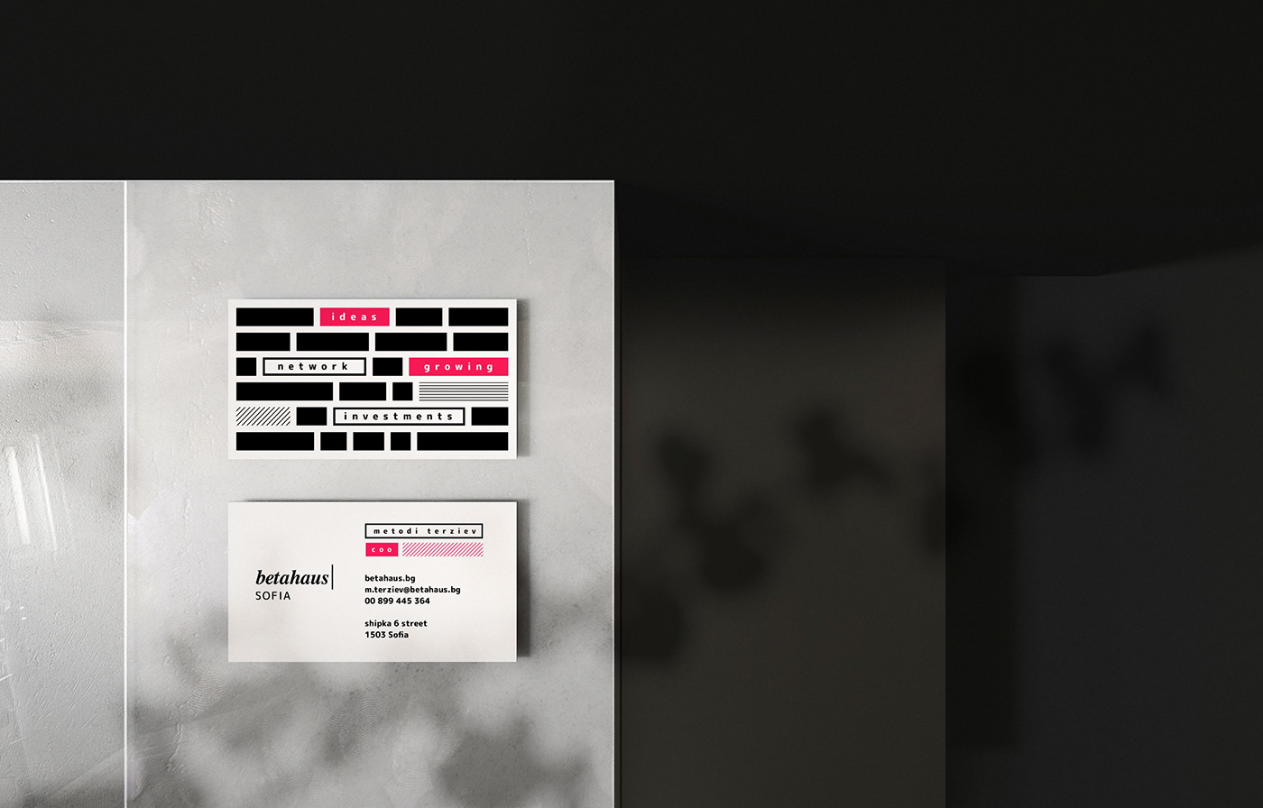
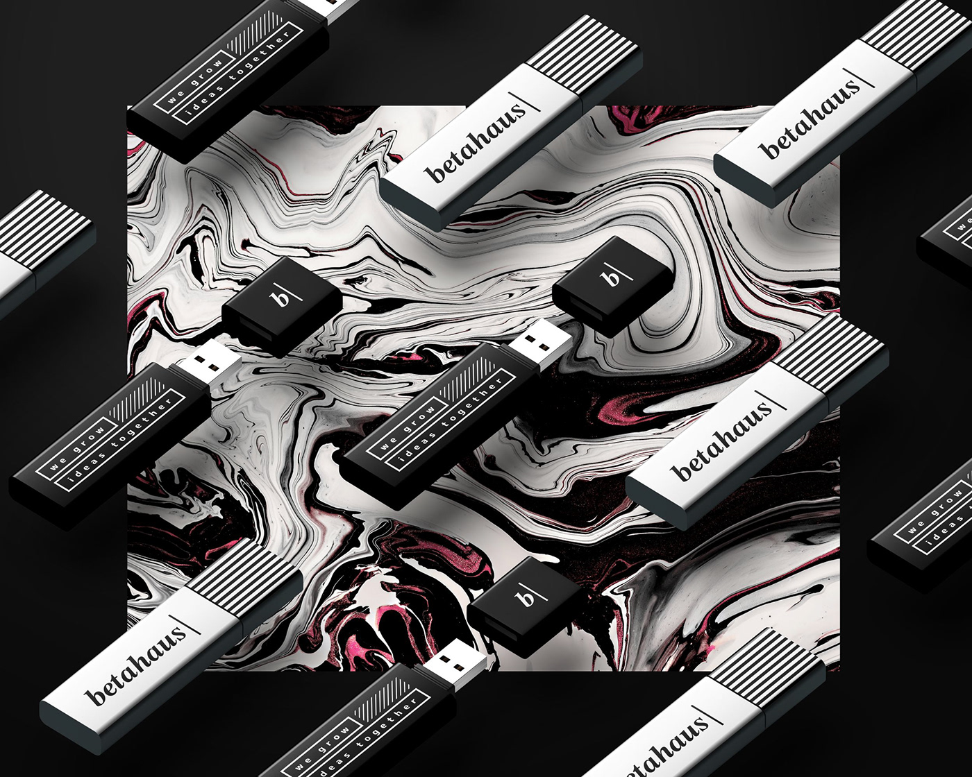
Firstly, I developed a new version for their local logo (Sofia), making it more compact, as per their request. Then I started to look at different ways to link graphically their brand to a contemporary style. In terms of typography, I decided to keep the current font they used (Times) for certain occasions and add a primary font for their graphics. I aimed for a rounded typeface to compliment the company’s friendliness. Another challenge was to find such a font that is 1) Rounded 2) Cyrillic 3) Google Font, and these were Rounded M Plus 1 for print and Rubik for their website. Consequently, the idea behind the visuals is supporting the community part of their brand values – every rectangular represents a brick, and put together, all of them form a house – betahaus.
Last but not least, I designed and developed their new website www.betahaus.bg


Thank you for your time!


